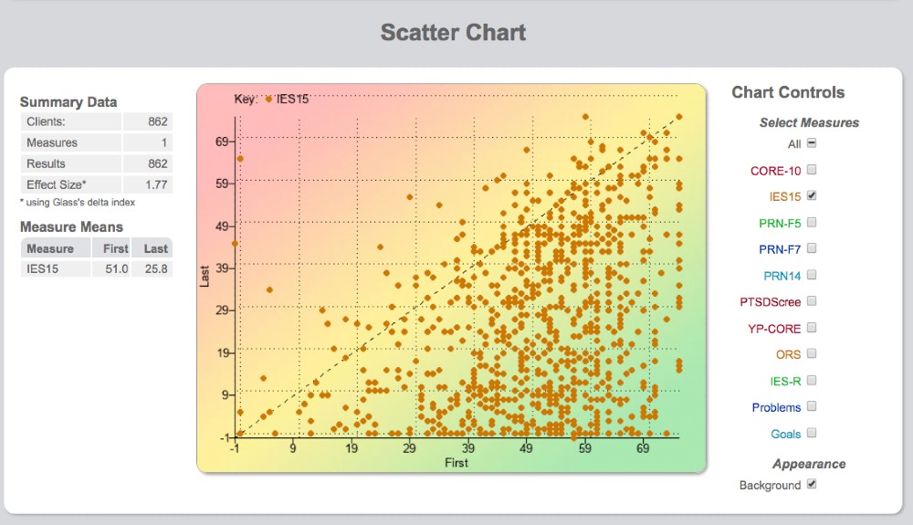
Scatter Chart
The scatter chart provides an overview of how all clients are doing on one screen. Each dot represents a client and shows a comparison of their first and most recent score for a particular measure.
Scatter chart overview
Each dot represents a client and a representation of the 1st and last available score for a particular measure. The X axis is the first score and the Y axis is the most recent score available (often the final score).
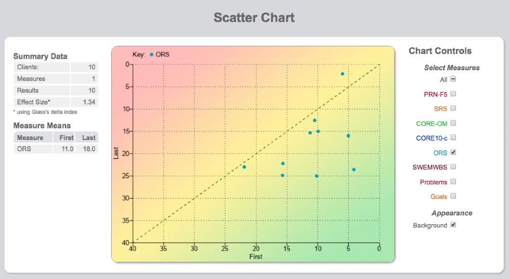
Reading the chart
The diagonal dotted line running from bottom left to top right is the no change line. Any dot on this line or to the left of it indicates cases not changing positively according to the measure in question. Dots to the right and below the line indicate positive progress.
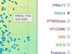
To zoom in on any particular case, hover on it to see the score and click on it to jump directly to the client chart.
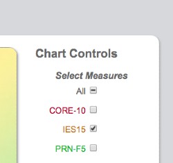
Scatter chart controls
To the right of the scatter chart are the chart controls. These determine what is displayed on the chart. One can choose to view all measures or any combination of measures. However, making sense of the scatter chart is easier when just one particular measure is chosen — for example, the measure your organisation has chosen to use as its routine benchmark measure.
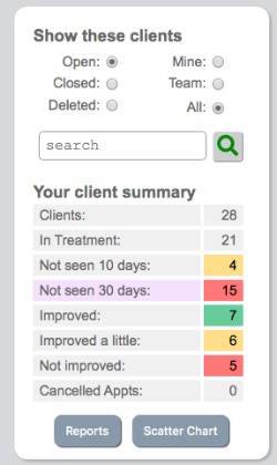
Accessing the scatter chart
While on the client list page there is the summary information panel to the left. At the bottom of this client summary panel you can access the scatter chart.
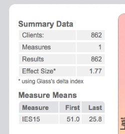
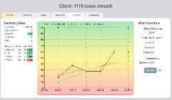
Summary data and effect size
The results displayed in the summary data depend on which measure (or combination of measures) has been chosen on the scatter chart controls and which client group was filtered on the client list page.
The average score at 1st measurement point, the average at the last measurement point, and the effect size calculated using a standard effect size calculation are all shown.