Charts
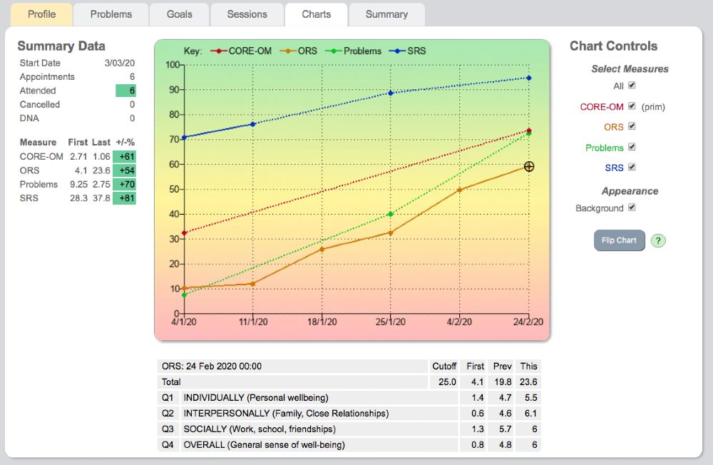
The progress chart provides a wealth of information about the client journey. All measures used with the client at any session are available to view.
Chart overview
When all measures are viewed together the scores are standardised on a % basis so the Y axis scores from 0 to 100. This gives an overall impression of the relative progress made on different measures. Each measure is colour coded and the key is offered at the top of the chart. The session date is along the X axis.
Chart controls
To the right of the chart are the chart controls. These determine what's displayed on the chart. You can choose to view all measures or any combination of measures. When one measure alone is chosen the page refreshes and the Y axis changes to the correct scoring range for that measure. If the measure has a known cut-off this is displayed as a dotted line. Background appearance can be altered to show or hide colour.
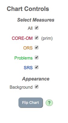
When All is chosen the chart can be flipped so green is at top or bottom. When any one item is chosen its components can also be displayed. Any combination of elements can be displayed simultaneously.
Goals and Problems on the chart
The Goals and Problems measures that you create display like any other measure on the chart. You can view them as an aggregated score and also view the individual goals or problems.
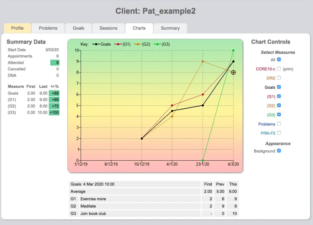
Summary data
To the left of the chart, summary data provides a useful reminder of the start date, number of appointments booked, attended, cancelled, or DNA.
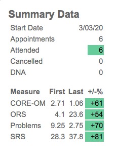
All measures used are listed, with their corresponding first scores and most recently available scores (last). The % improvement of the score from its original value is offered and colour coded depending on the degree of improvement.
Colour coding
The colour coding is simple and of immense clinical value when used correctly:
- Red — no change or deterioration
- Amber — some change
- Green — substantial change
It's important to be guided by the colour, not by the percentage figure.
Chart lines
When a measure is not scored continuously at every session the chart lines are dotted. The key explaining each measure colour is at the top of the chart and that colour is maintained in the chart control panel.
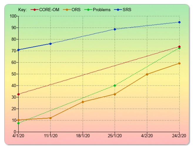
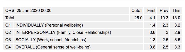
Table below chart
Clicking on any particular scoring point on the chart will display a drop-down table below the chart. This displays the individual item responses and on the right side offers 3 scores: the 1st available; the previous score to that session; and the current score. This allows you and your client to compare how particular items have changed between sessions.